Random Studio Images From Last Semester
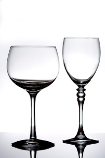
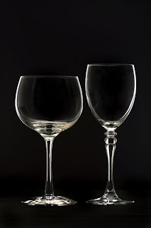
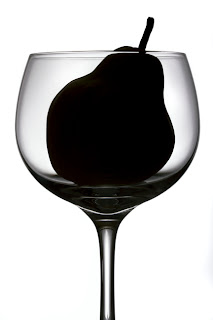
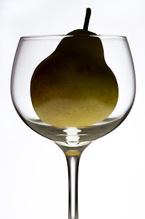

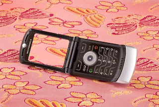
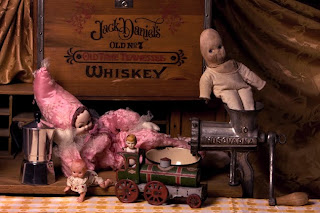
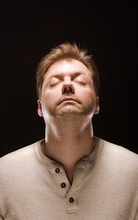
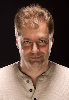
Just a few images from last year. School starts in a week and a half. This semester is going to be jam packed full of work, but it should be doable. Soooo many major projects. I just hope it isn't as tough as last semester. I made it on the dean's list again, but pulling 3-4 back-to-back all-nighters every single week for three and a half months might just kill me if I try to do it again. If I find it's too much, I can always get rid of one class because I'm taking more than I need.
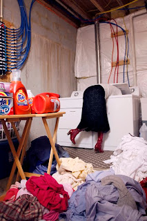
The image of me and the washing machine was the impetus for my final. The rest of the images are pretty formulaic and not done particularly well. We crammed a lot into one semester, so there was really only one week's shot at each. I know how to do them all properly now, so it should make each type of shooting easier in the future. I'll be buying my set of strobes soon and have some ideas in mind for that, but it might have to wait for winter break.


Comments
My favorites are the top two glass images, both of Scotts pix, and the last one of you getting eating by the washing machine. I am not quite sure what you mean by those shots you did like the washing machine shot being poorly done though. They looked fantastic to me. The light was excellent in each with no bright flash look or any shadows to speak of, the poses are unique and creative, the message in each clear, and very sharp focus with no motion blur. Again, not sure what could possibly be seen as "not done very well."
Second, I get rid of unwanted shadows with softboxes, fill lights, and fill cards. Positioning of the lights is key too. If you study a photograph, you can get the same lighting by looking at the shadows. We looked at a lot of photographs in class then emulated the lighting afterward. This is what I mean by formulaic. It's pretty standard stuff. Even the ones with Scott. I'm not crazy about the glare on his head or the shadowing around the top of his shirt (though the shadowing works in a creepy way). I should have brought the kickers in the background up higher to help get rid of the unwanted shadow. Because of the small studio I was in, there was nothing I could do about the glare on top of his head. The light was too close and I couldn't turn it down anymore. The phone image was part of a larger group where we simply played with our cell phones with a "to do" list. I could have pushed that image more if I'd had the time. The table set up with the old toys was for an assignment where we were supposed to emulate the light in a painting. I went with generic Northern Renaissance, and it works the way it should. The washing machine shot was a bust because I couldn't get the lights I wanted. As a result, it just looks like one big old strobe. It's a hot light, actually, but the overall situation ended up working anyway. The strobe kits were all checked out waaaaayyy in advance.
They're all okay really, but they were also experiments, so afterward, it's easy to say, "I could have done this" or "I should have done that". They're fine though for what they are, and I'm happy enough with them.
I see the light on the top of Scotts head and see what you mean, though I hadnt noticed it before. The color of his hair blended it very well so I never saw until you mentioned it. So the shine comes from a light being too close? Is that why using a meter is so important? So you dont have to take a million shots and have to keep moving the lights around so its not too bright in one place? I swear, that whole metering thing where the studio lights are concerned is just one huge mystery for me. Later on my studies I have a class on studio lighting and that should fix the problem, but for now, its all just a huge guessing game. And talk about a small studio. All I have to shoot in is my tiny front or back rooms but its what I have to deal with for now. I think thats why I love available light so much. No fucking with artificial light sources.
I really think the light in the washer shot works very well for the subject matter. It adds a realism to it I think. I suppose if you wanted it to not look so real then having all the lights you wanted would be best. I would love to see that shot redone with the lights you would have liked to have had so I can see what you mean because right now I havent got a clue what it should look like other than how it looks right now. I just know I really like it the way it is.
In normal studio lighting, you have three lights, a key light, a fill light (or card) and a back light. I found this site with a set up to look at: http://www.ephotozine.com/article/Studio-lighting-advice--Part-3-setting-up-your-lighting-4779. The key light is your main source for lighting your subject, and it's set at an "attractive" angle which creates nice shadows--usually 45 degrees to your subject and up above them. The fill you already know about--it's often at about 45 degrees too but set at a much lower intensity (half or less) of your key light. Metering is useful here, but you will end up taking test shots anyway. This is why Polaroid film was such a big deal to studio photographers before digi came along. The back light will either be an actual background light that will show your background, or it will be some sort of hair light that casts a soft light on the hair and/or shoulders or your subject, separating them from a dark background. Again, metering is useful here because you can use your reading from your key light to help you get into the range you need to be into for a soft background or hair light before you even get to any test shots.
Kickers are accent lights. They just throw some unexpected light into the mix. In the case with Scott, there is one kicker down below and in front of him, throwing light up from and odd angle. I guess I misspoke in regard to the background lights. They are acting more like hair lights, but they are also acting as accent lights in an unexpected way.....hmmm.....no, they are background (hair) lights. That's what I'm going with here. The real kicker light would be the one in front and below him. The one above him is the key light--NOT set at a 45 degree angle and NOT attractive--this was intentional. We looked at a few images done this way in class.
As for the washing machine, yeah, it wasn't the lighting I wanted, but it did work in a different way. I decided to play with that a little to get to the lighting I wanted with my final--just one light, but set up in a way that isn't quite right, you know what I mean? I wanted it to seem normal, but not quite right. Just enough to make things seem a tad unreal.
Again, thank you so much for all of this wonderful info!